
The Art of Citymaking
Festival Identity
We built a festival brand the way you build a city, block by block.
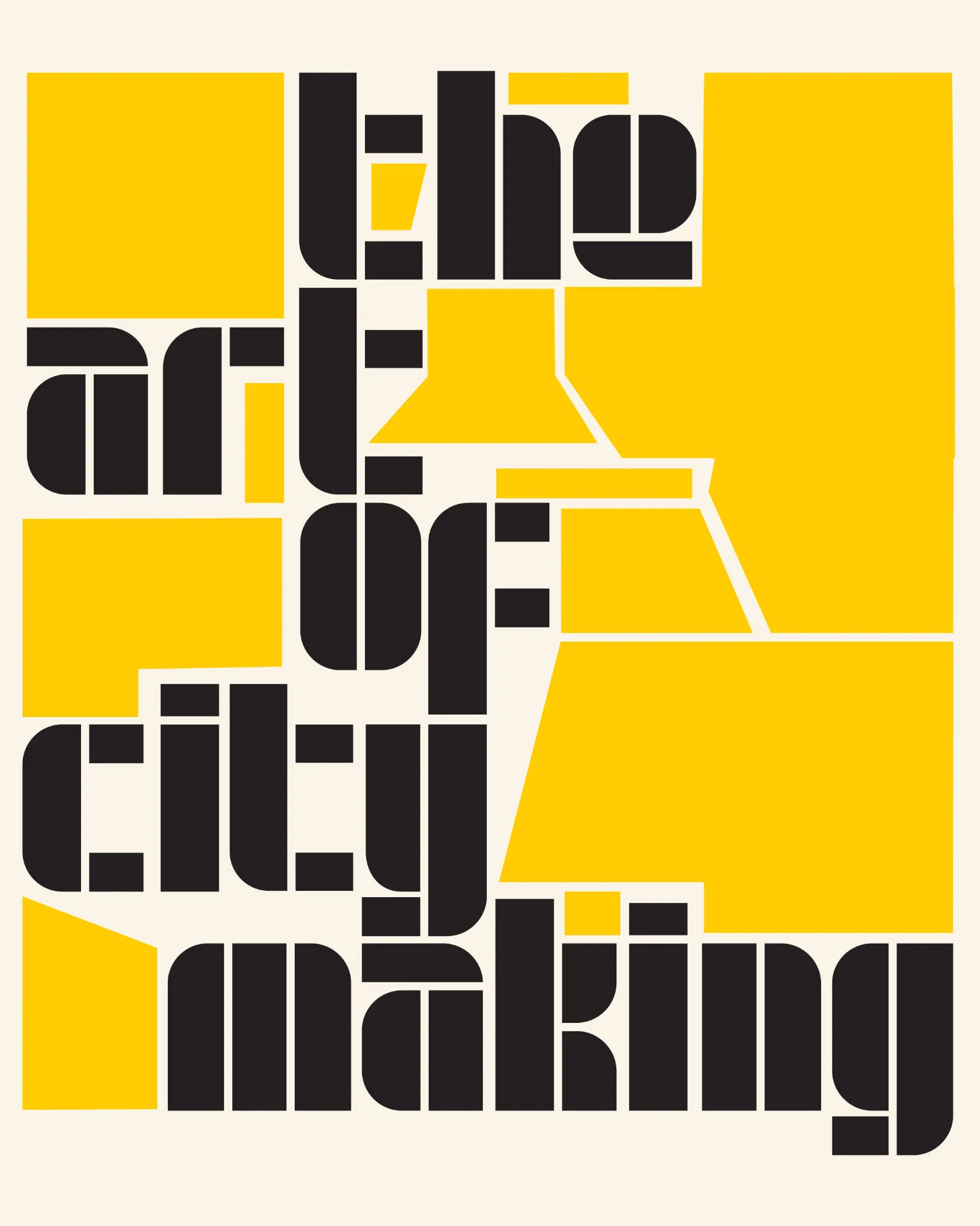
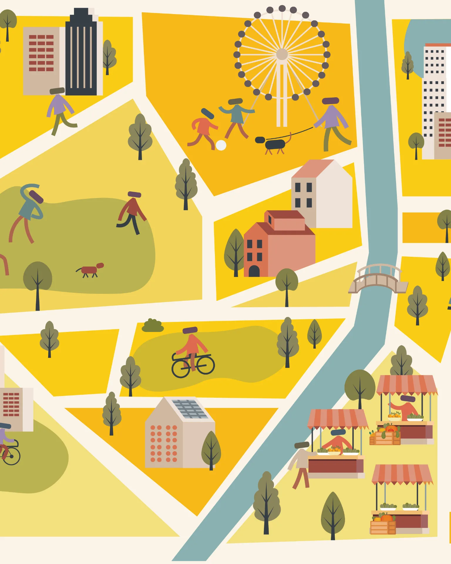
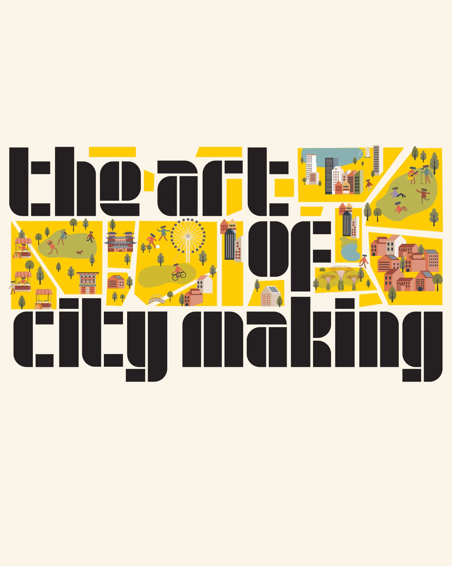
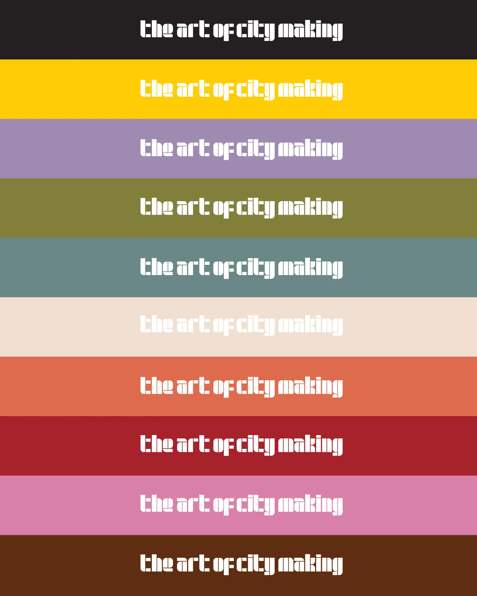
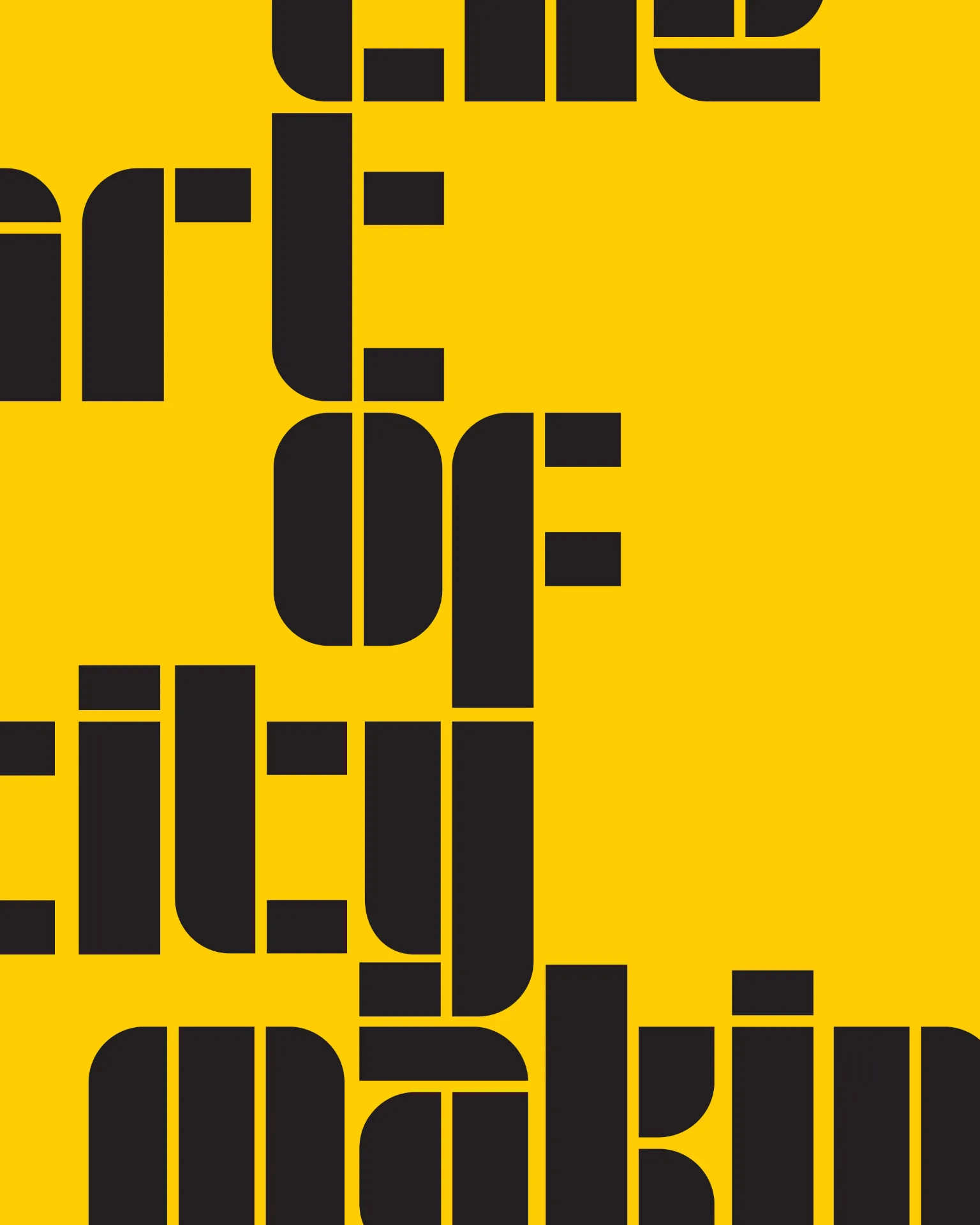
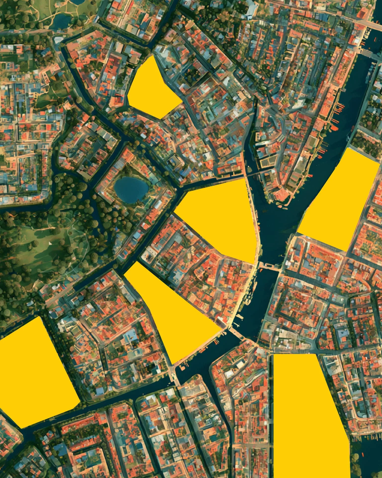
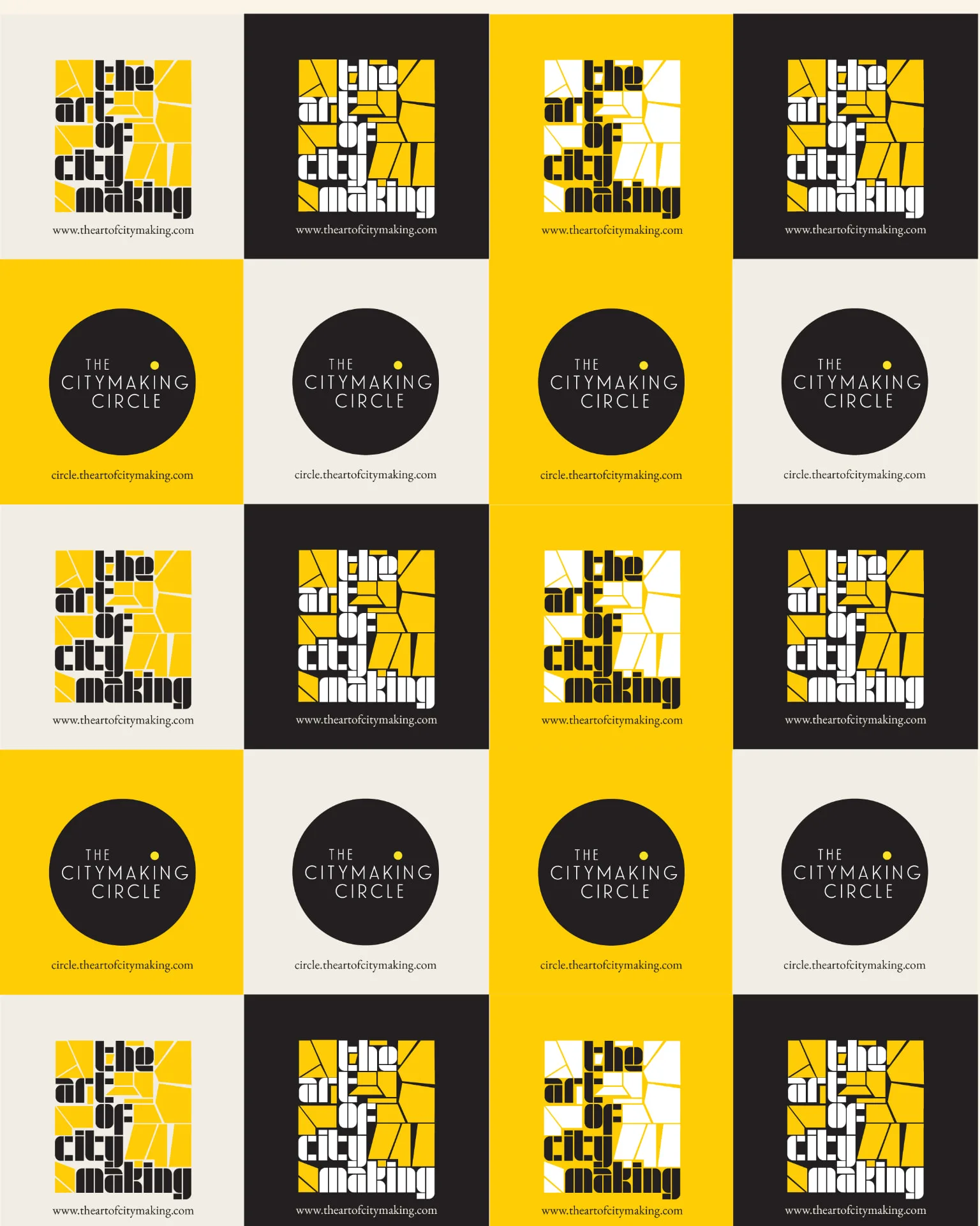
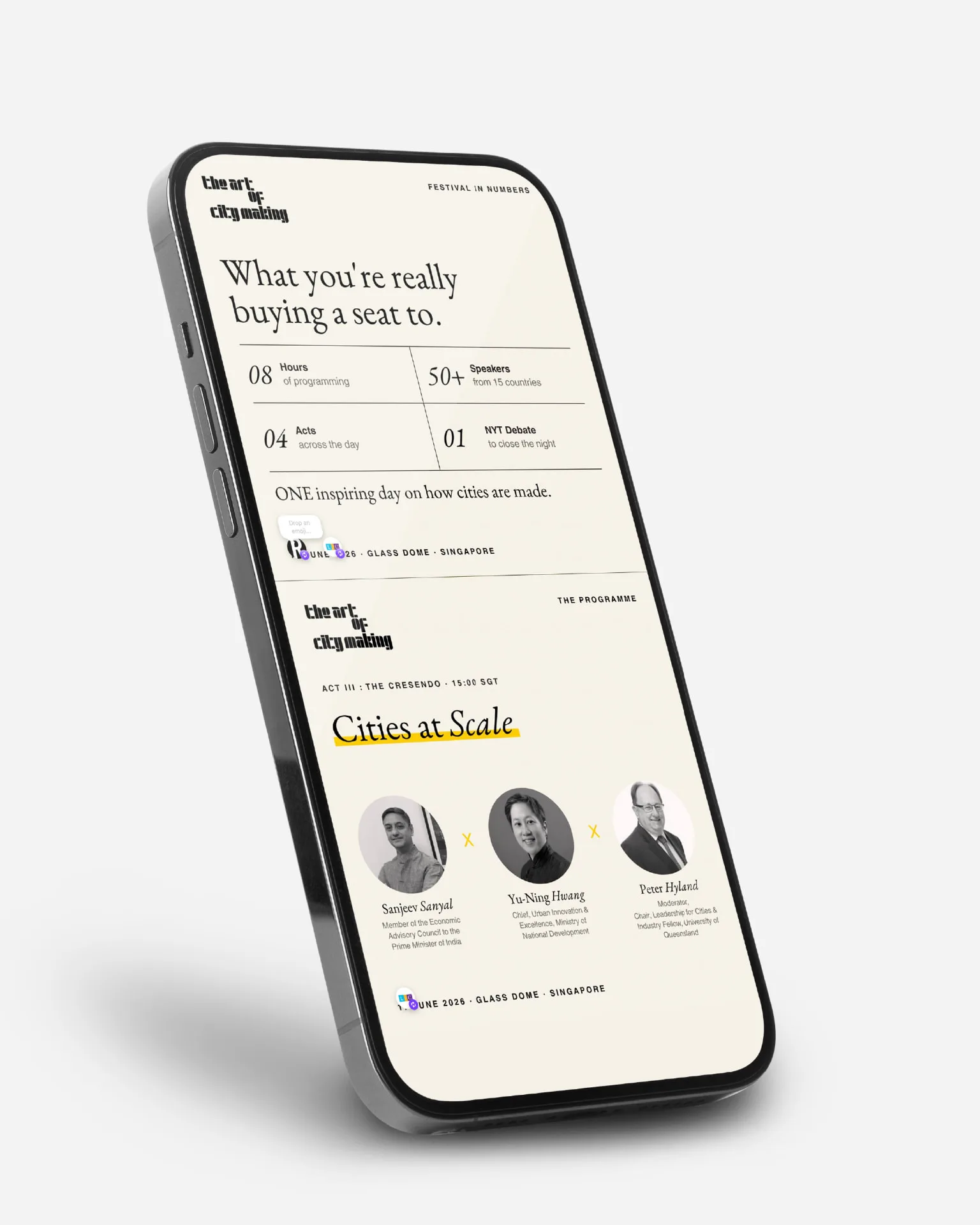
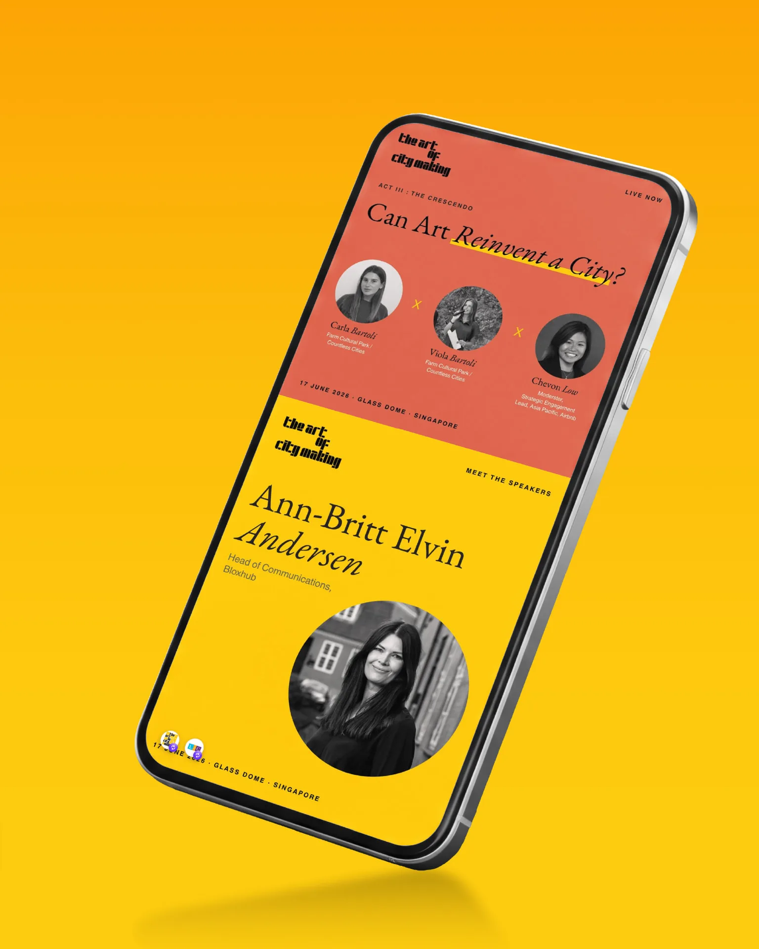
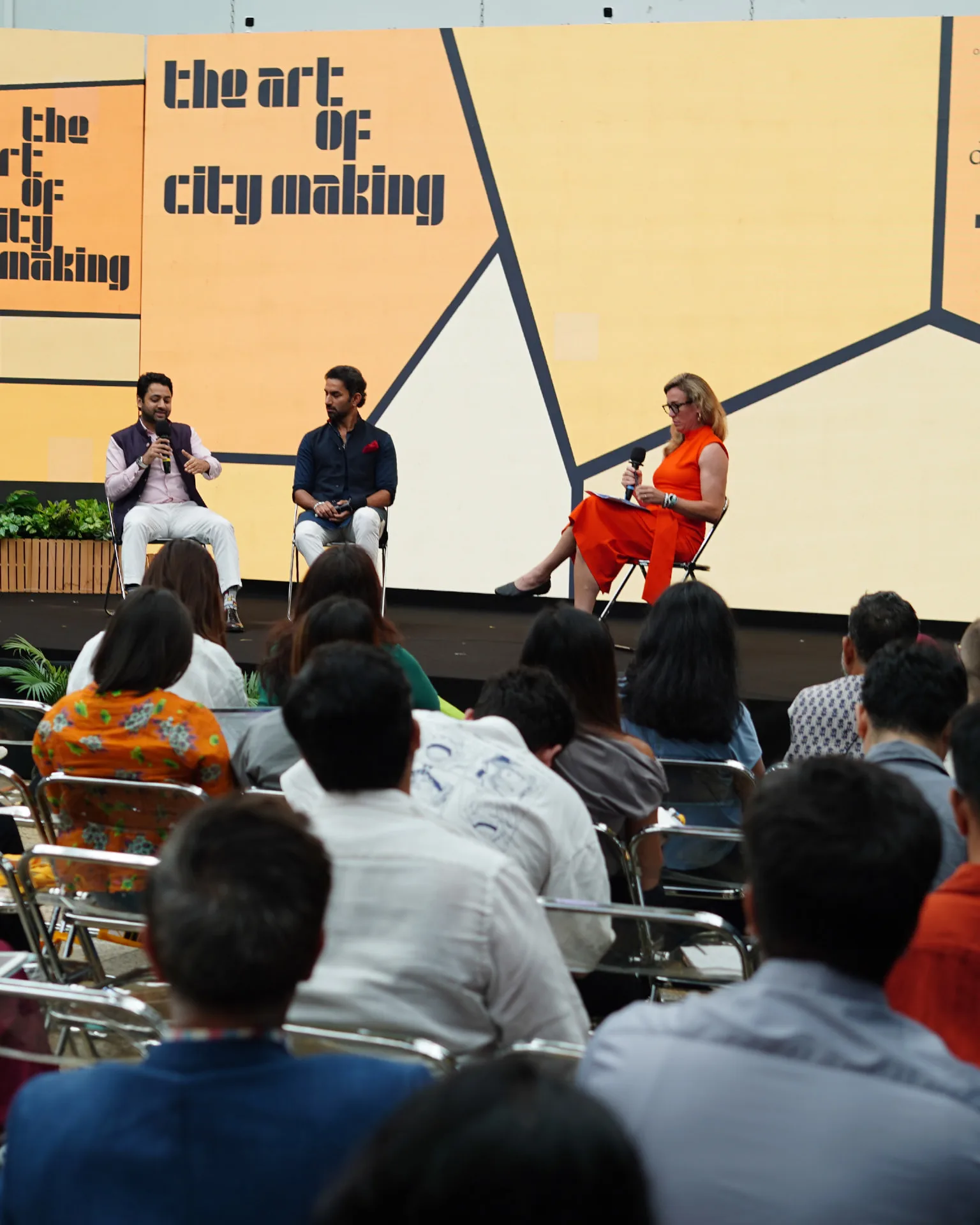
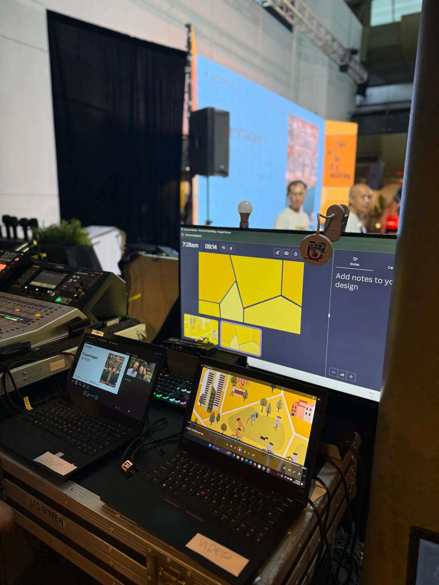
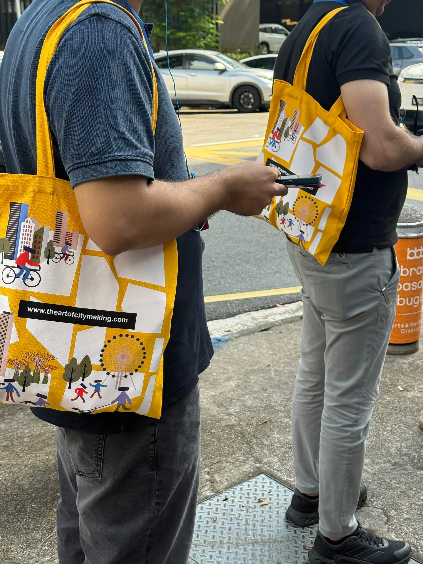
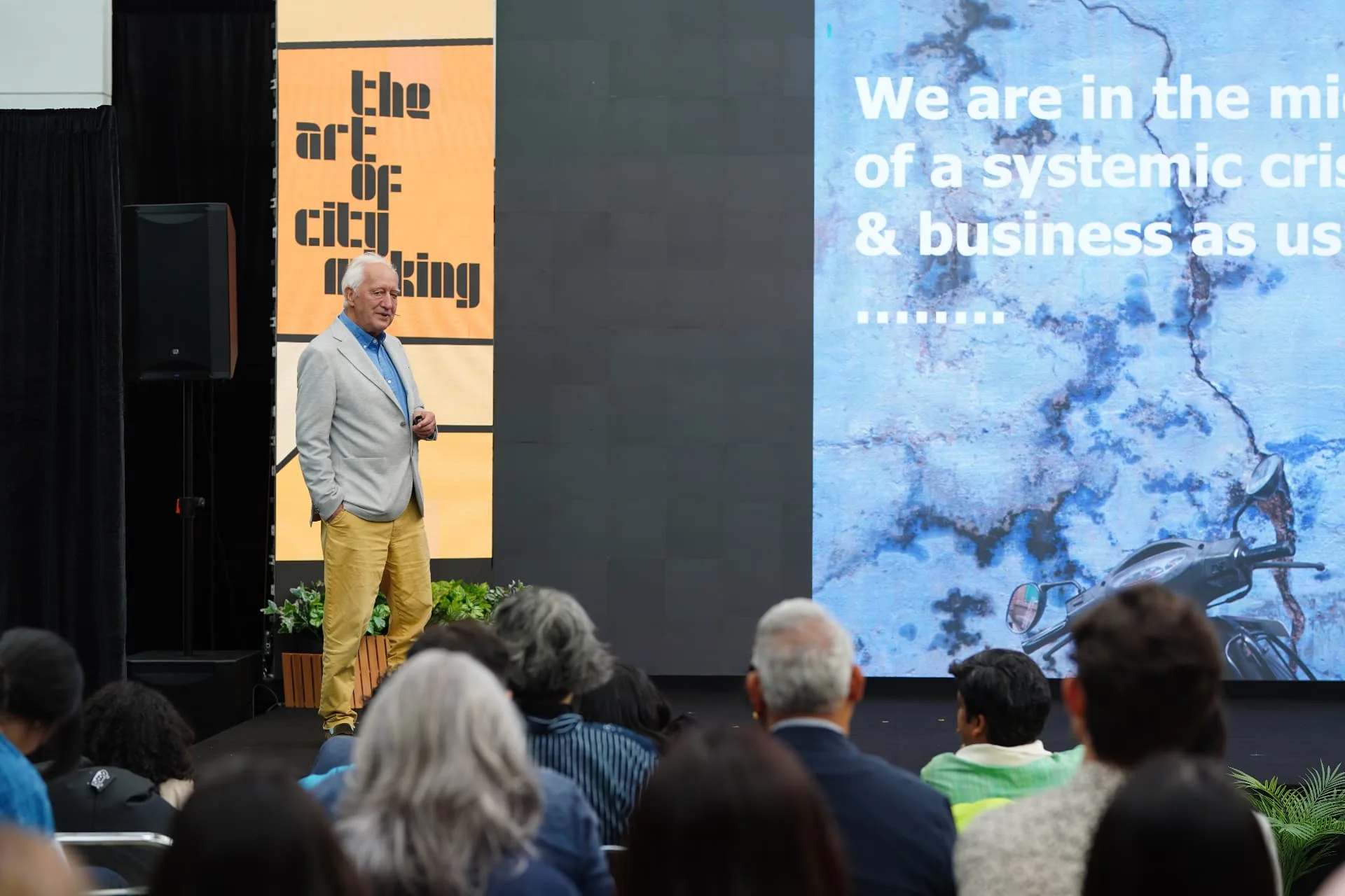
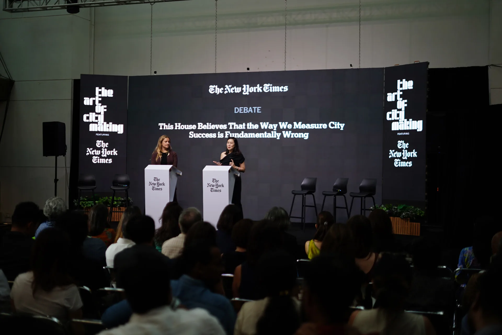
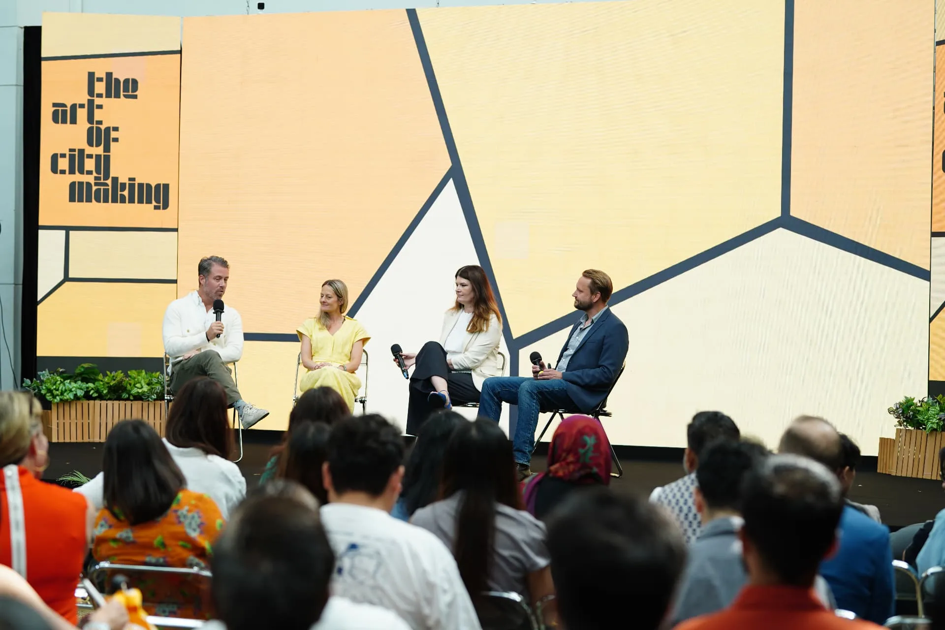
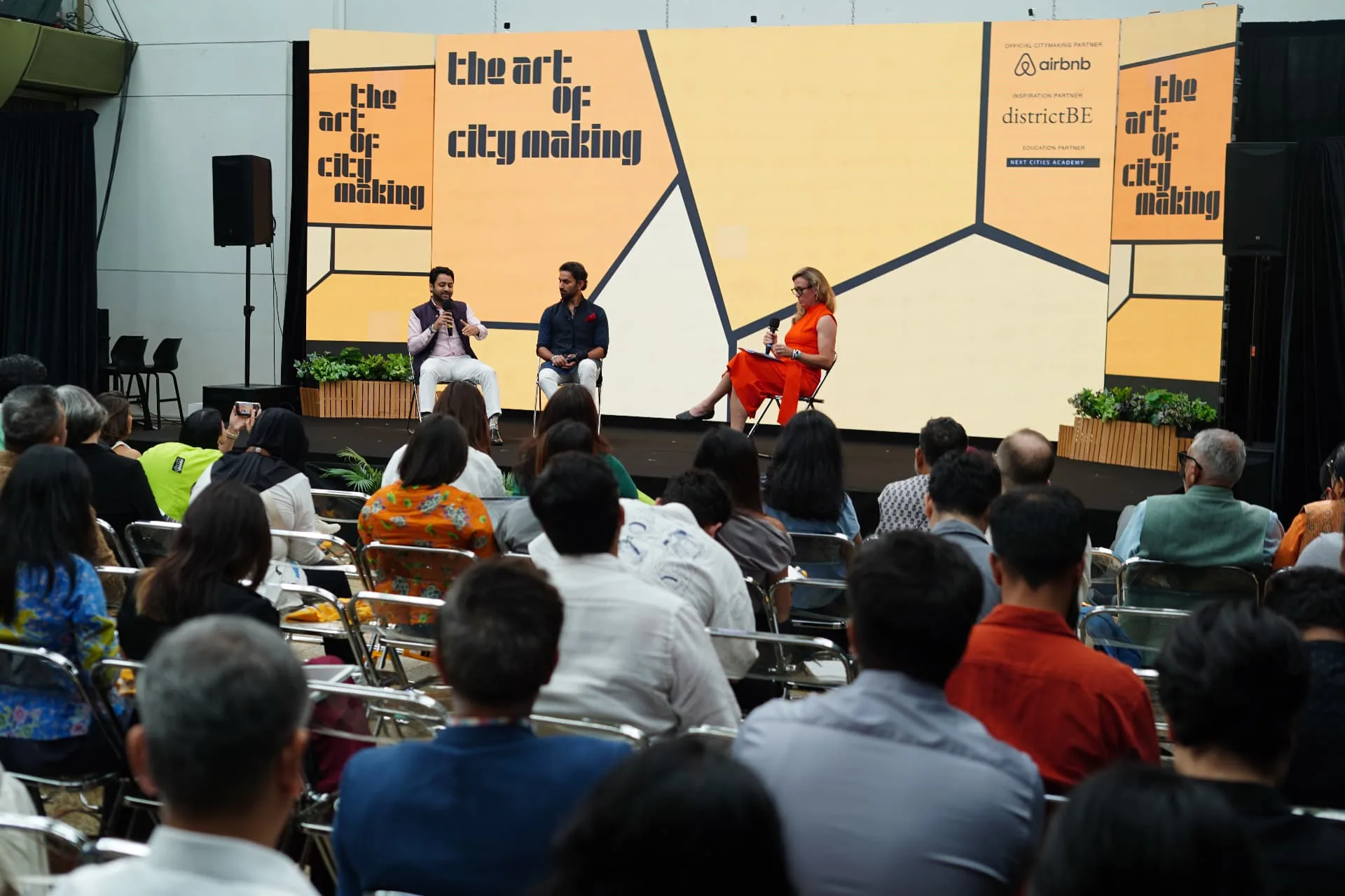
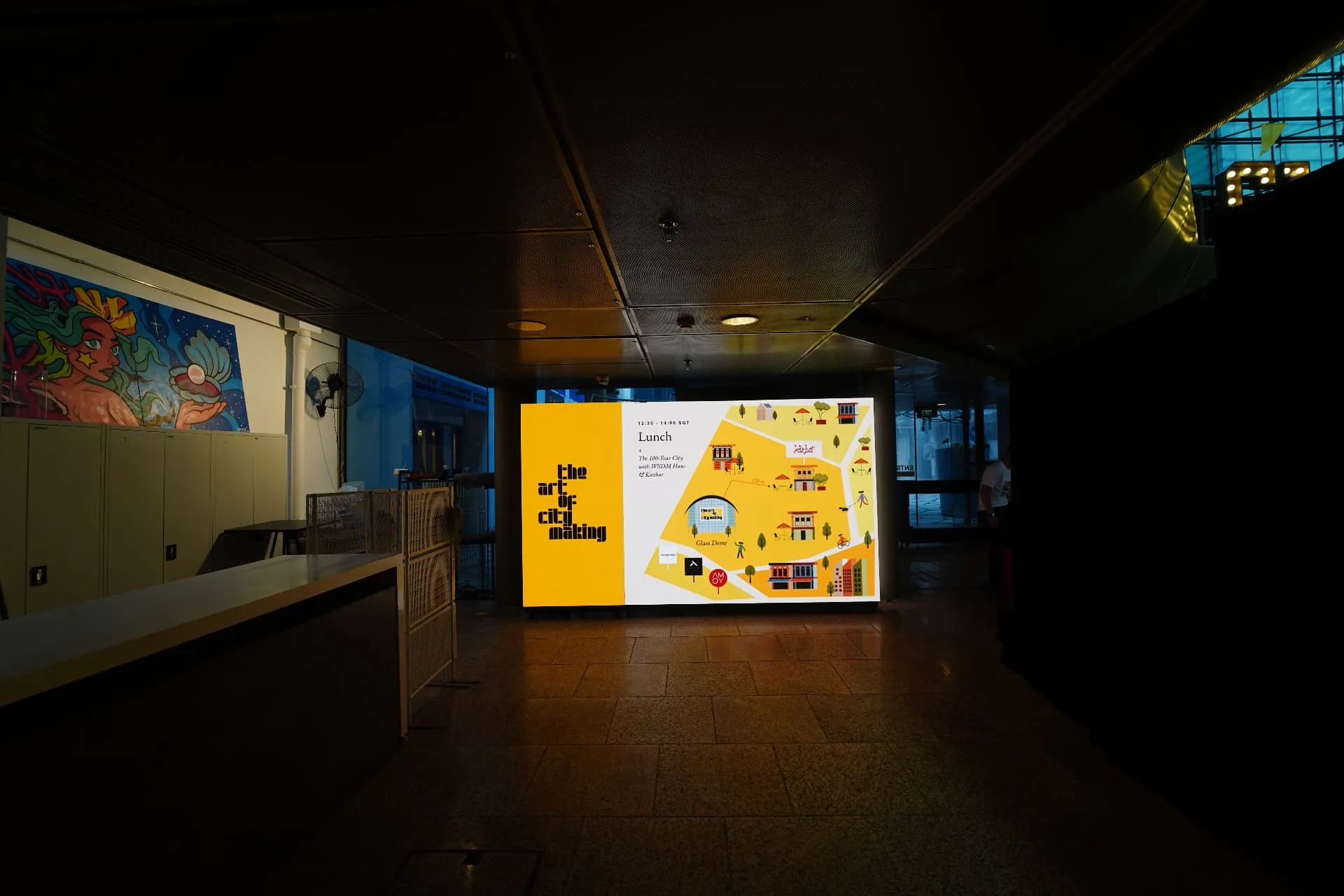
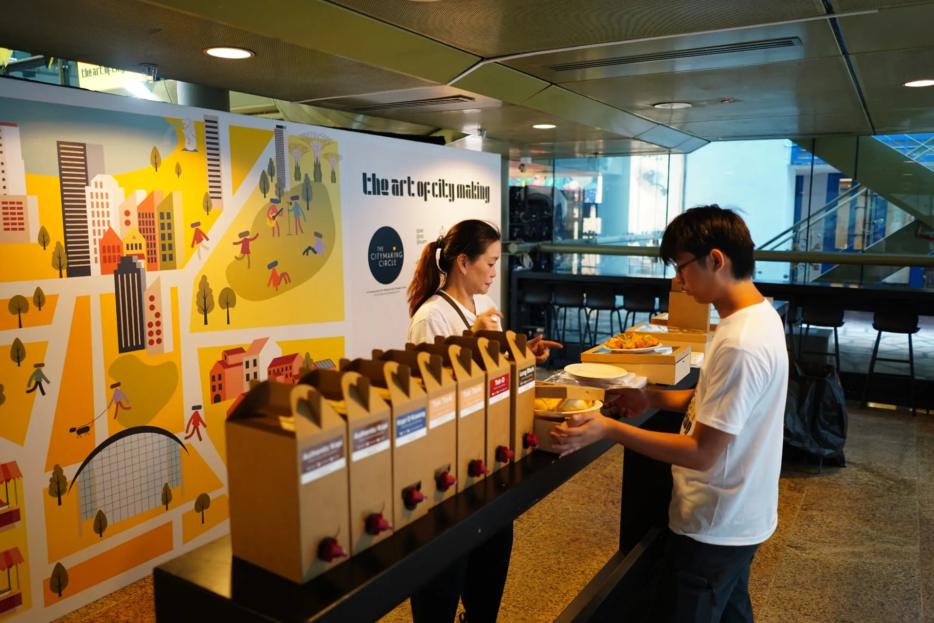
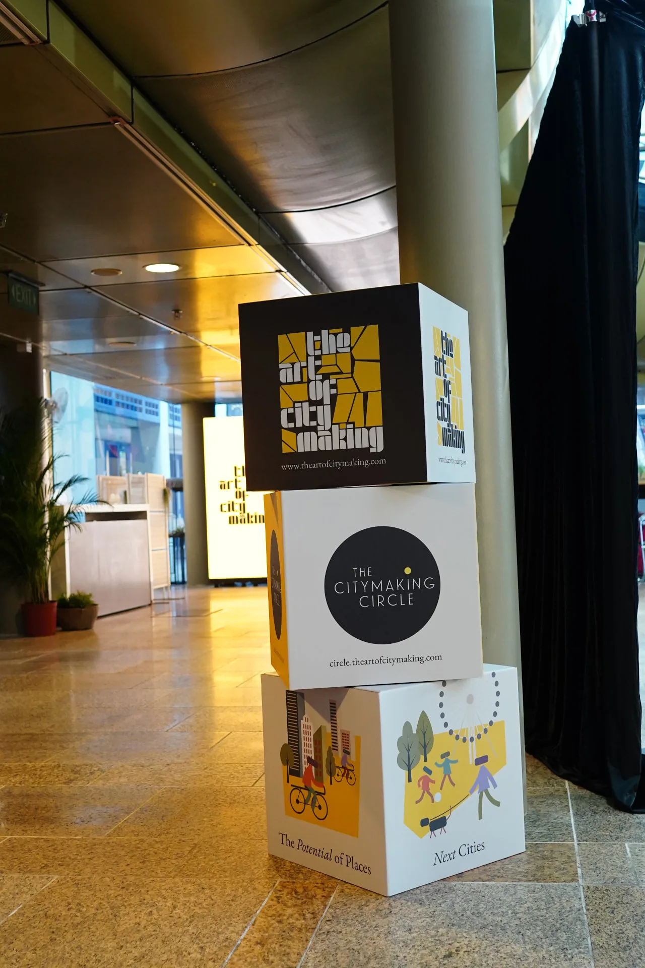
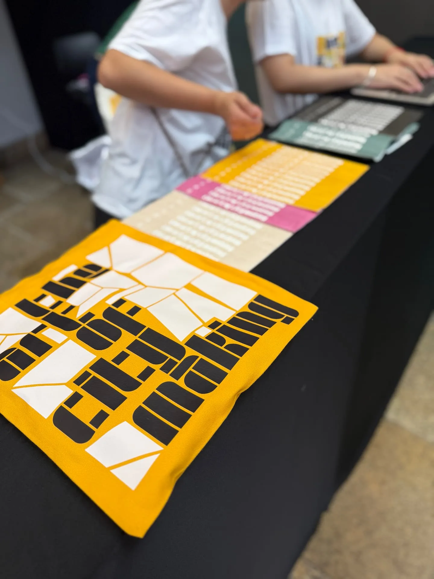
We built a festival brand the way you build a city, block by block. The Art of Citymaking is a festival about how cities evolve as places to live, connect and participate. The inaugural edition took place in Singapore in June 2026, during World Cities Summit week, shaped around three themes: Adaptive Neighbourhoods, Urban Software, and Placemaking & Legacy. We wanted to make an identity that feels unmistakably urban without leaning on skyline clichés, one that holds up on a stage the width of a room and on a phone screen. So we treated the city itself as the design system. Working closely across time zones & geographies - across goa, singapore, US - the festival identity and experience design came together because of great rapport, shared values and a belief that this initiates a conversation that is both urgent and timely. The logotype is solid type, derived from and encased within a grid of city blocks. The counters read as courtyards; the gaps between blocks read as streets. Up close it's typography, from above, it's a plan. The palette is predominantly yellow and black, among the most common colours in any city: taxis, road markings, hazard lines, signage, construction. From there it opened into an illustration system built on the festival's three themes, all drawn in the same block vocabulary. The festival experience was extended across multiple forms, formats and media, creating a vibrant, positive identity that resonated with the audience.

Experience Design: wearemixd Festival Identity: switchandroy Strategy: Anupam Yog Spatial Planning: Tulsi Grover Design Direction: Saurav Roy Social Media & Communication: Erin Lee Motion Identity Direction: Upasana Nattoji Roy Illustrations: Namya Motion Design: Taher Print & Paper Craft: Paper Carpenters Photography: Coromandel Productions