RocketCharge
Brand Identity
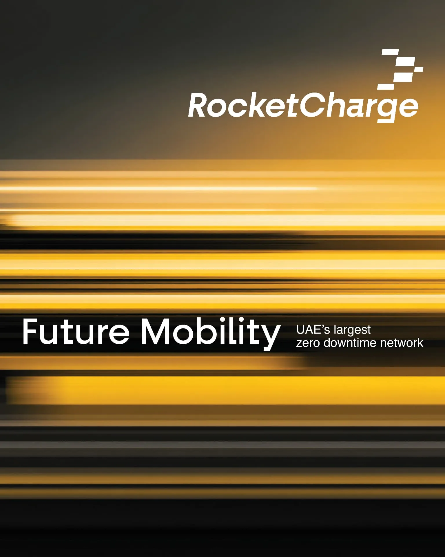
RocketCharge is a future-focused EV charging brand built around movement, bringing a bold identity to infrastructure, digital experiences, and everyday mobility.
EV charging has quickly become a familiar category. The same blue and green palettes, plugs, batteries, leaves, and lightning bolts appear again and again—making it harder for brands to establish a presence of their own.
For RocketCharge, we set out to create an identity with a different point of view. One that spoke to speed, momentum, and the confidence of a well-connected charging network, without relying on the usual EV cues.
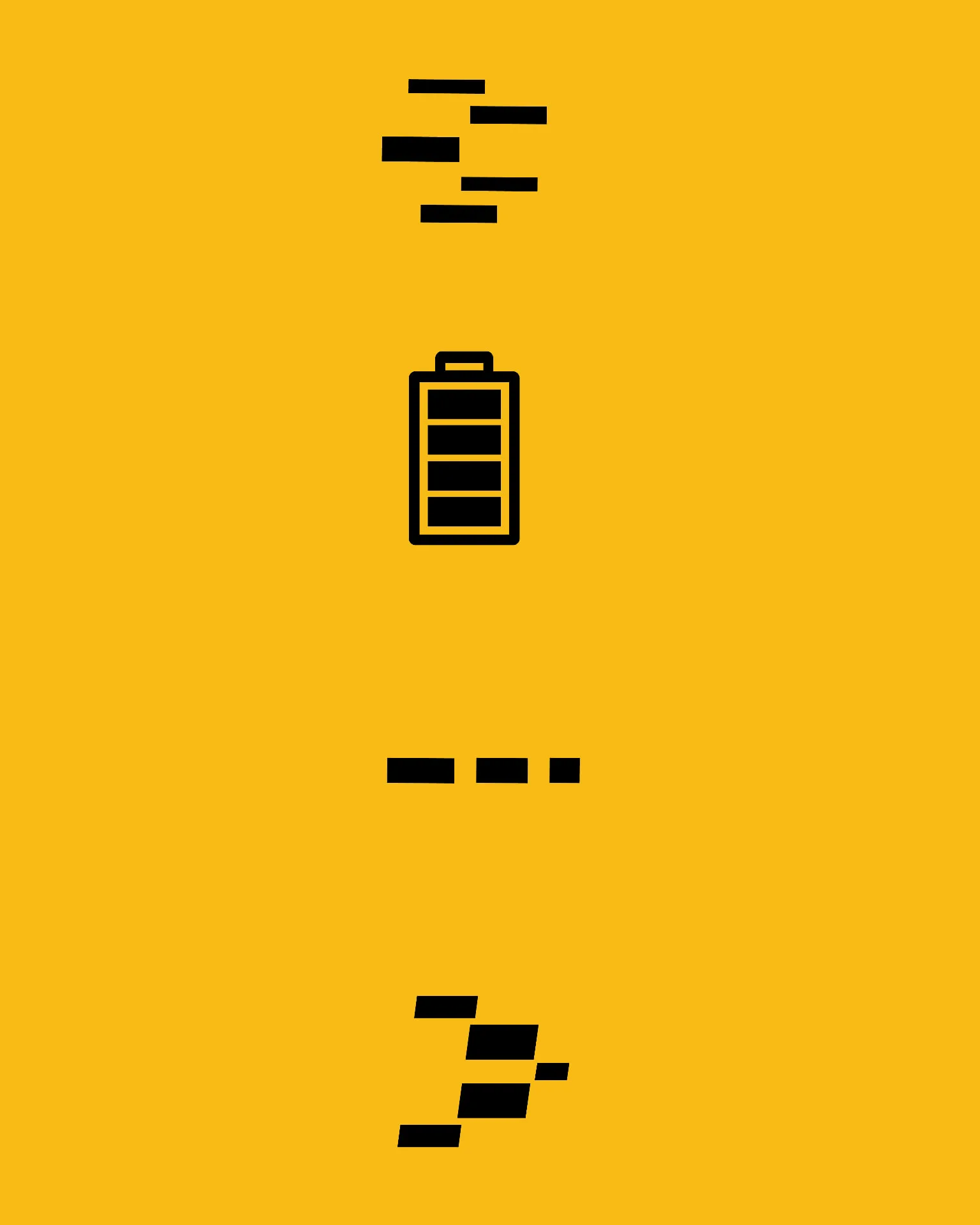
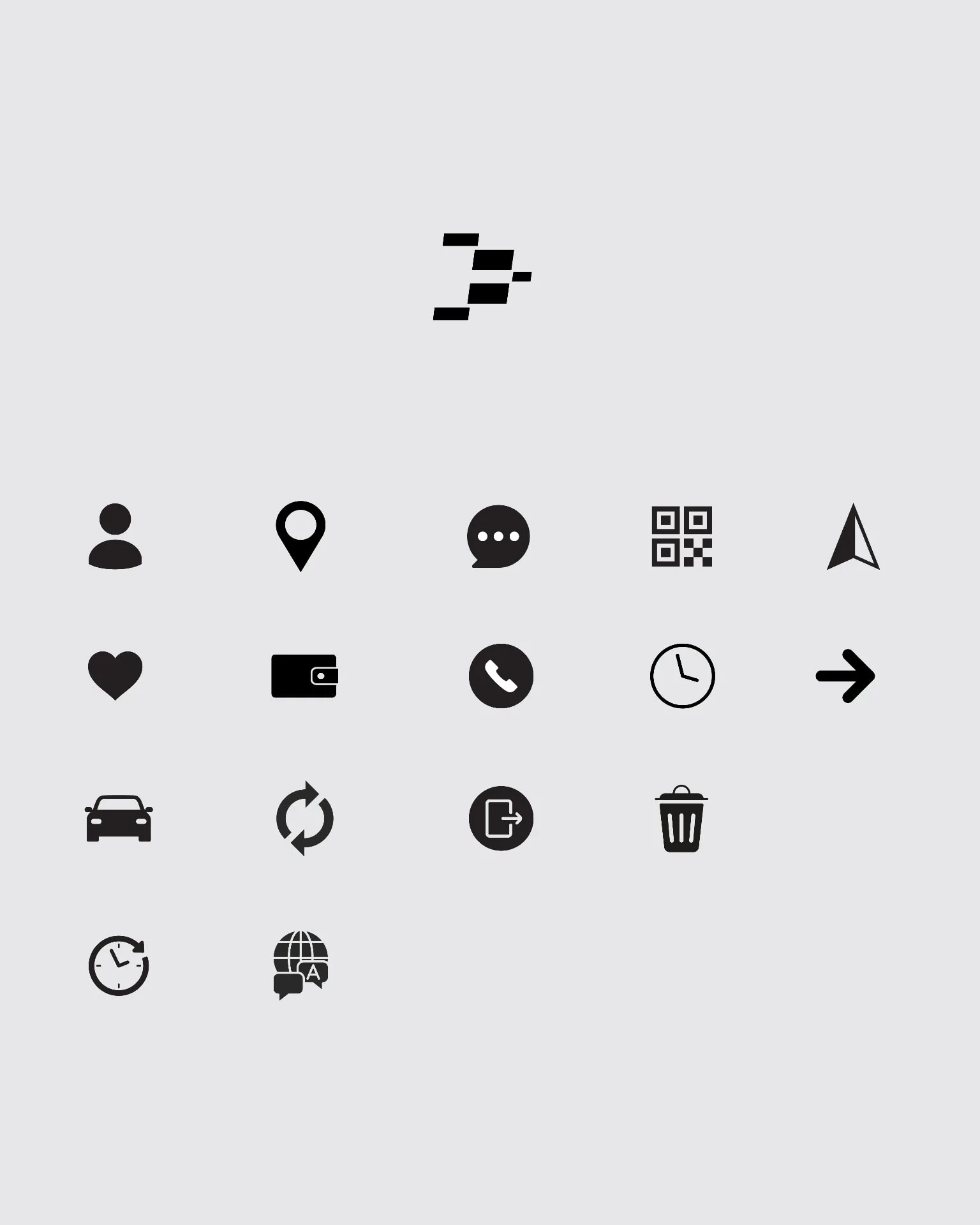
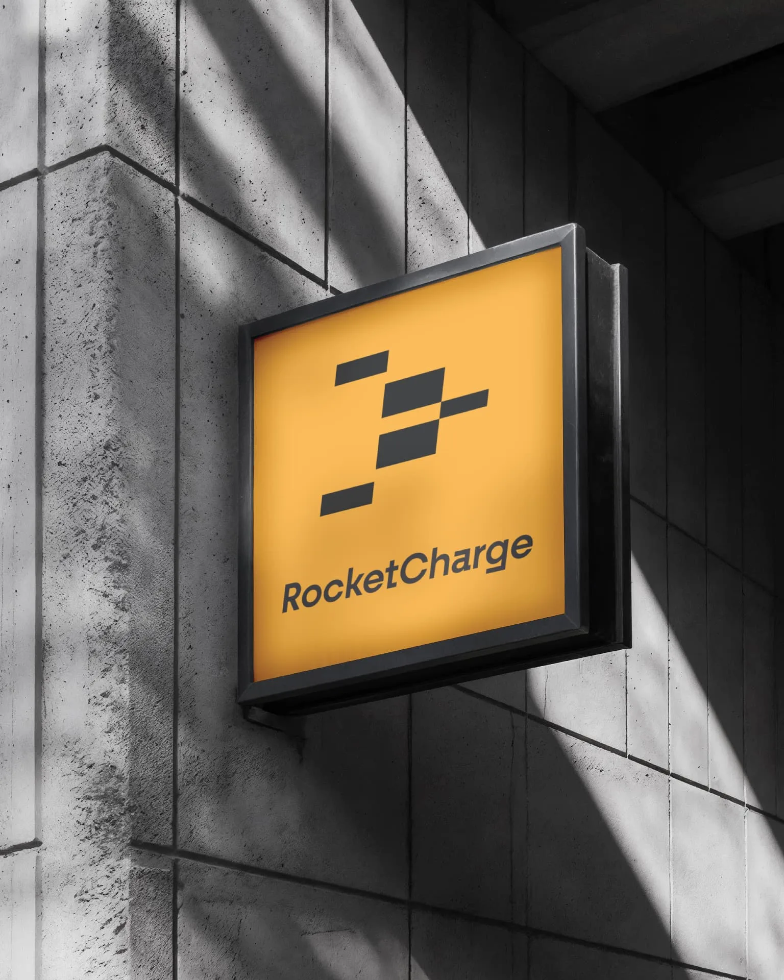
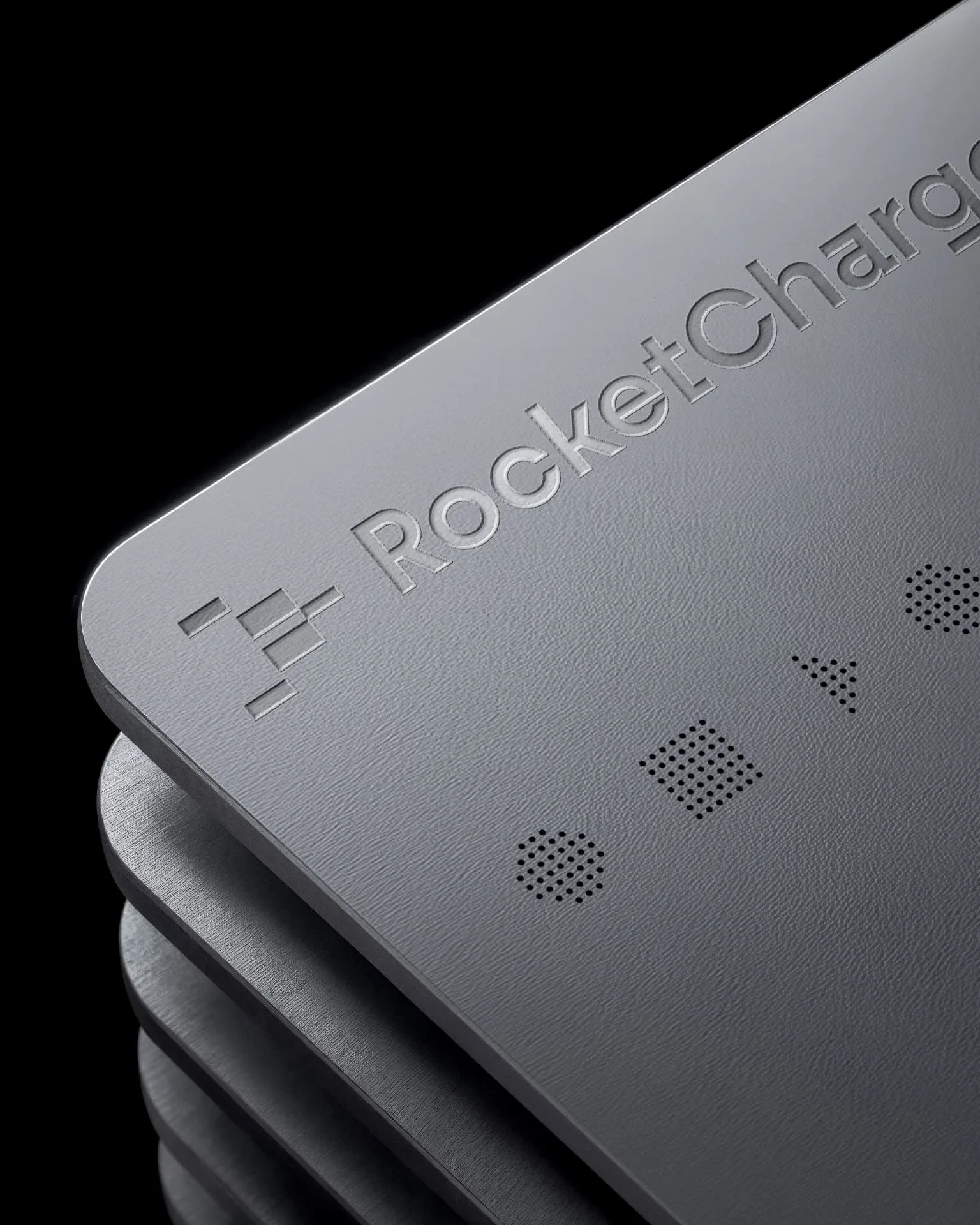
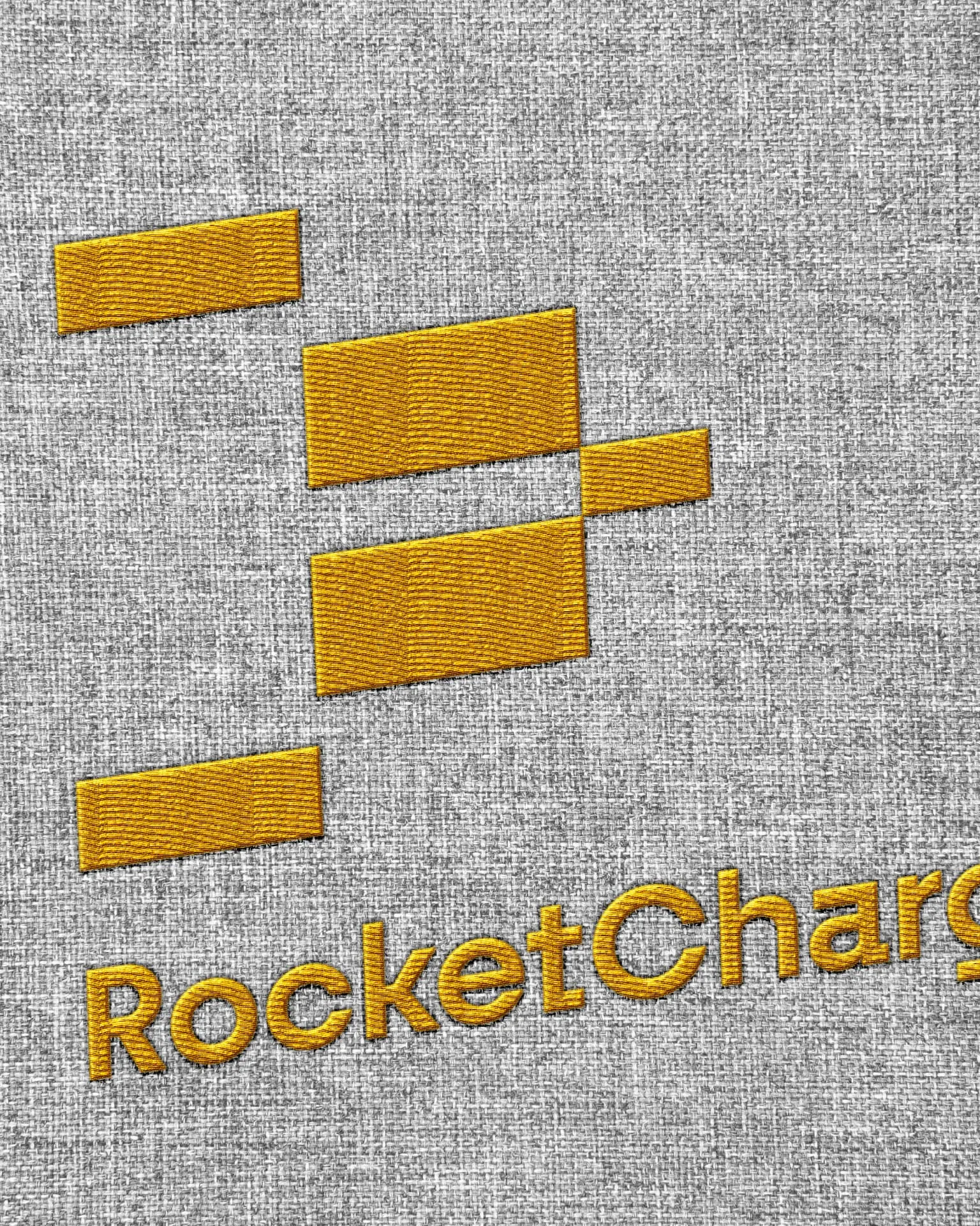
The central idea was movement. The RocketCharge logo is formed from a series of modular speed lines that come together to create the silhouette of a rocket. It gives the brand a clear sense of direction and acceleration, while staying simple enough to work across every scale and application.
The result is a mark that captures the spirit of the brand: energy in motion, dependable progress, and a future that is already on its way.
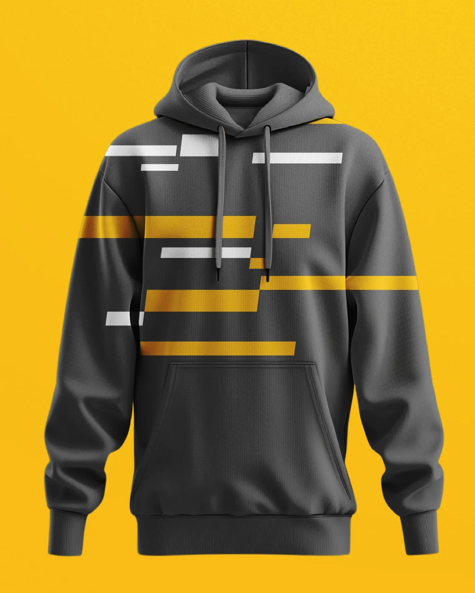
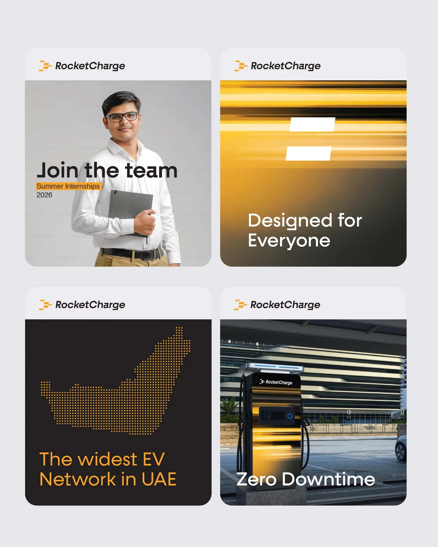
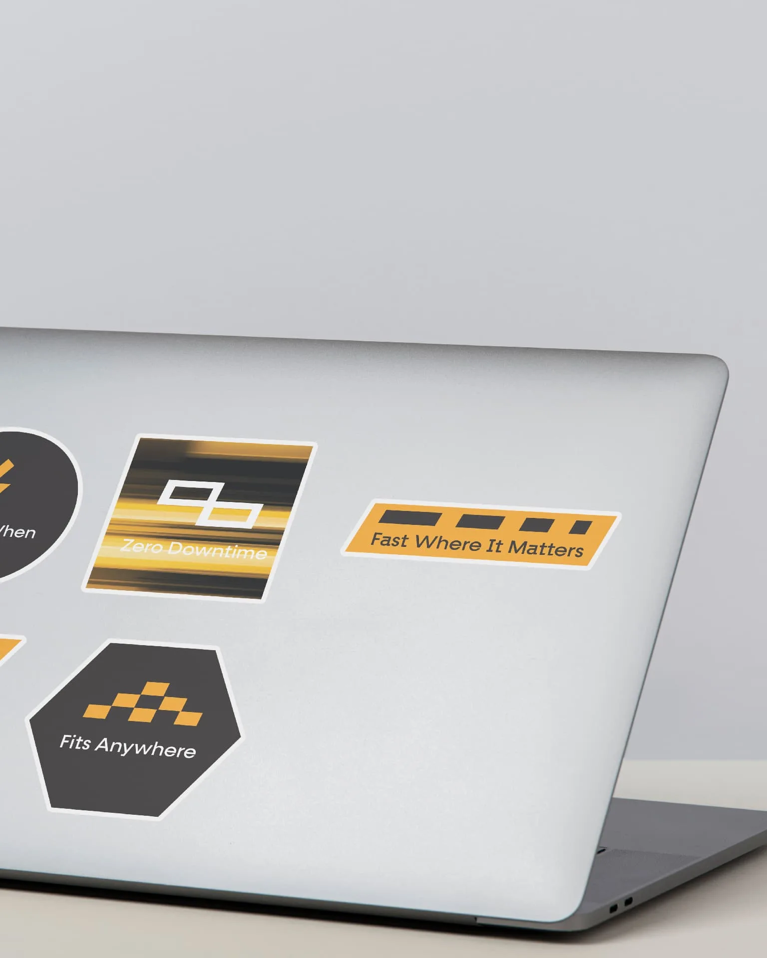
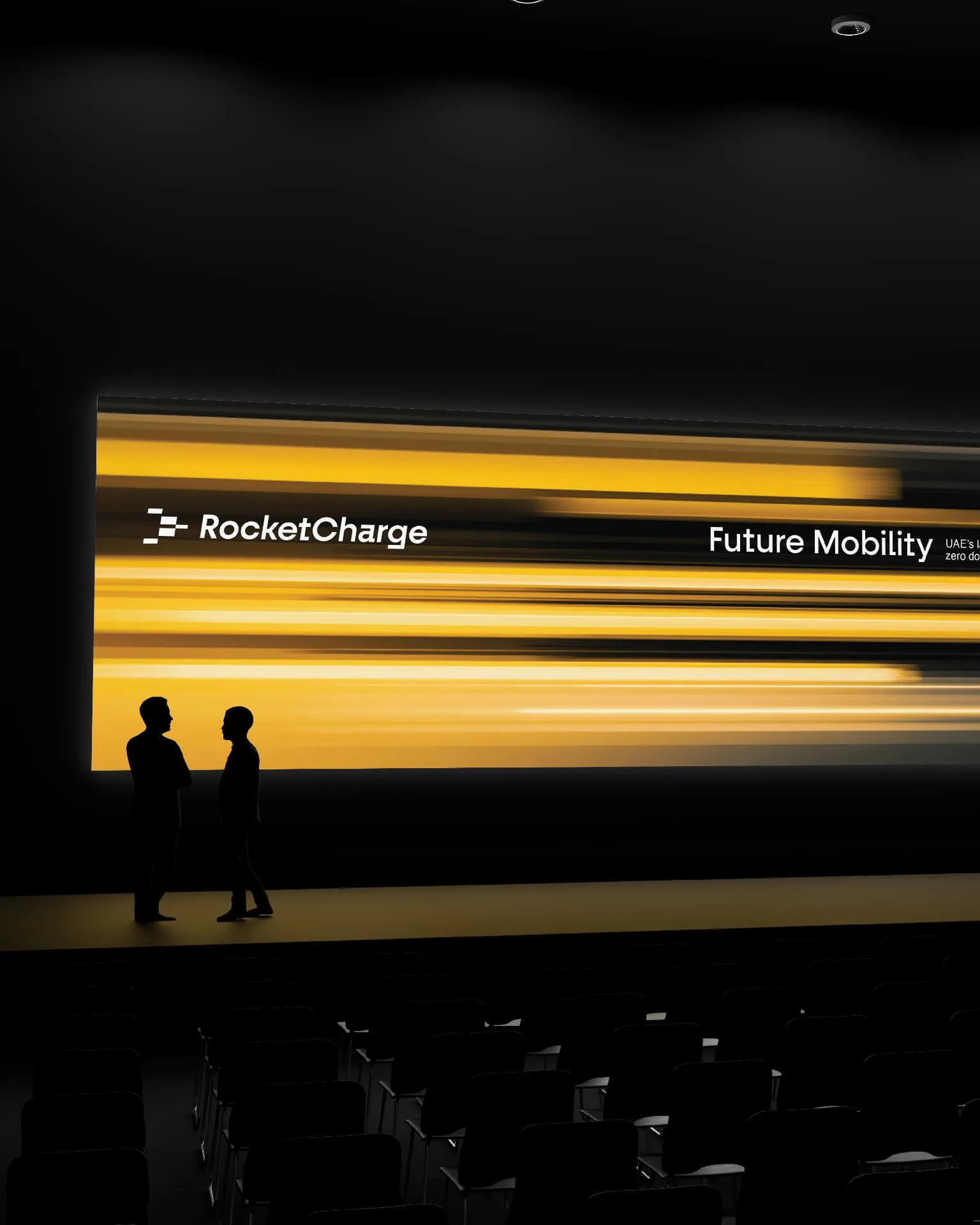
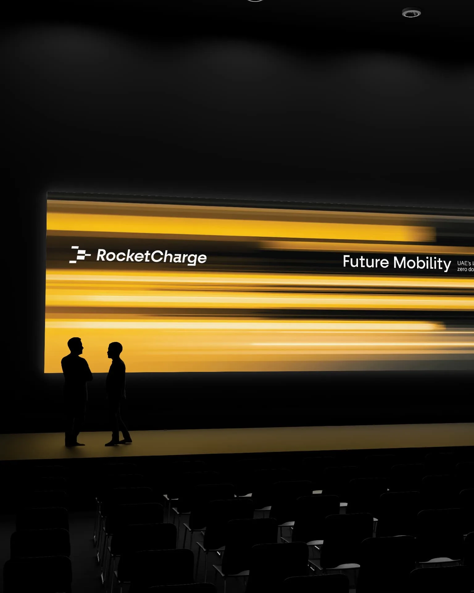
The speed lines do more than create the logo. They form the basis of the entire visual system. Repeated, layered, scaled, and rearranged, these elements create a flexible graphic language that can shift to suit different moments—from bold, high-energy compositions to quieter background textures. Whatever the application, there is always a clear connection back to the RocketCharge mark.
This gave the brand a distinctive visual signature that could carry across a growing ecosystem of physical and digital touchpoints.
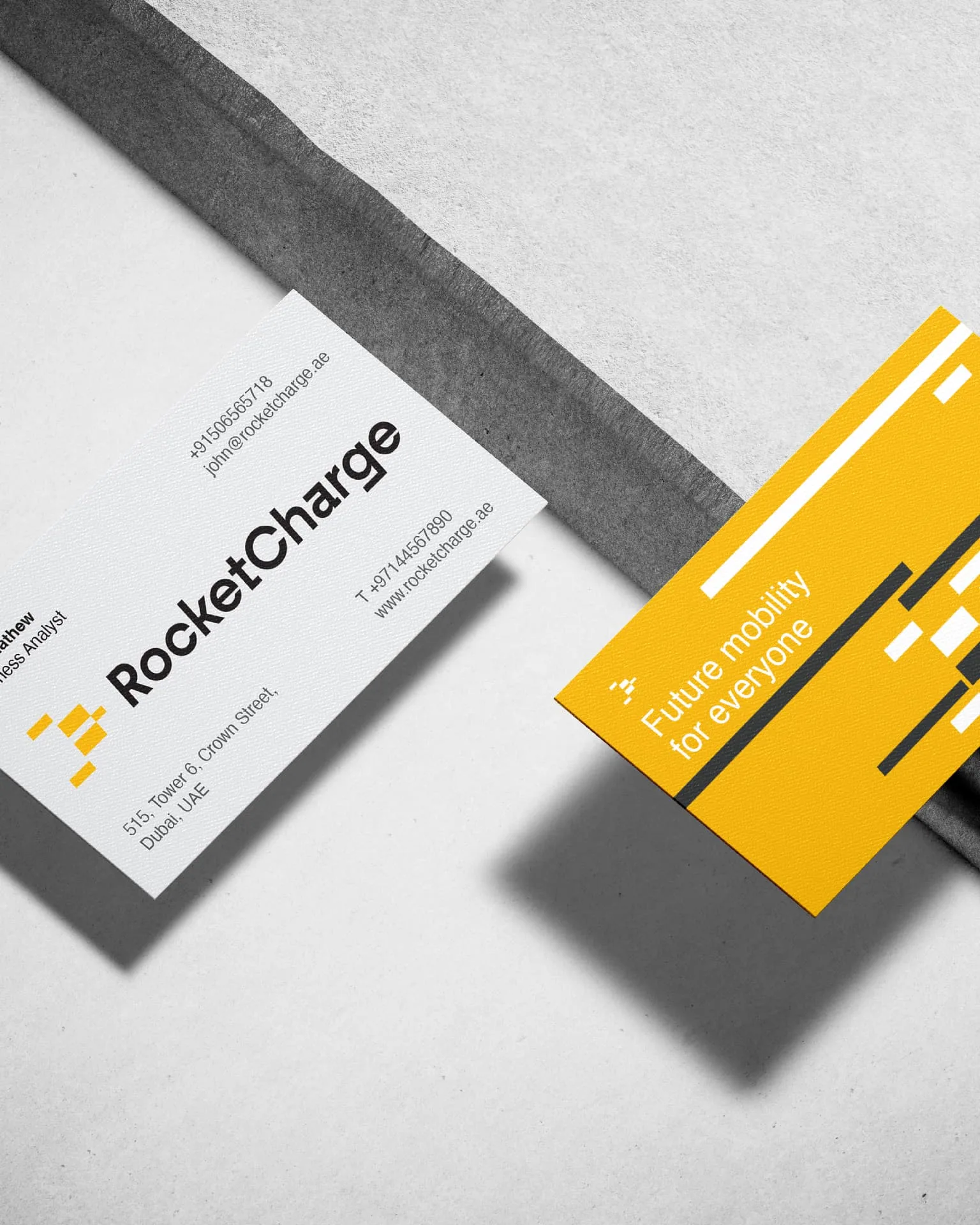
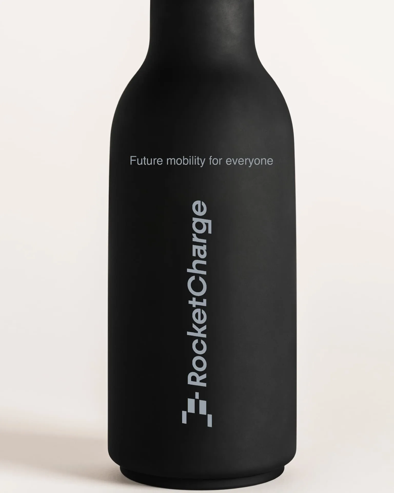
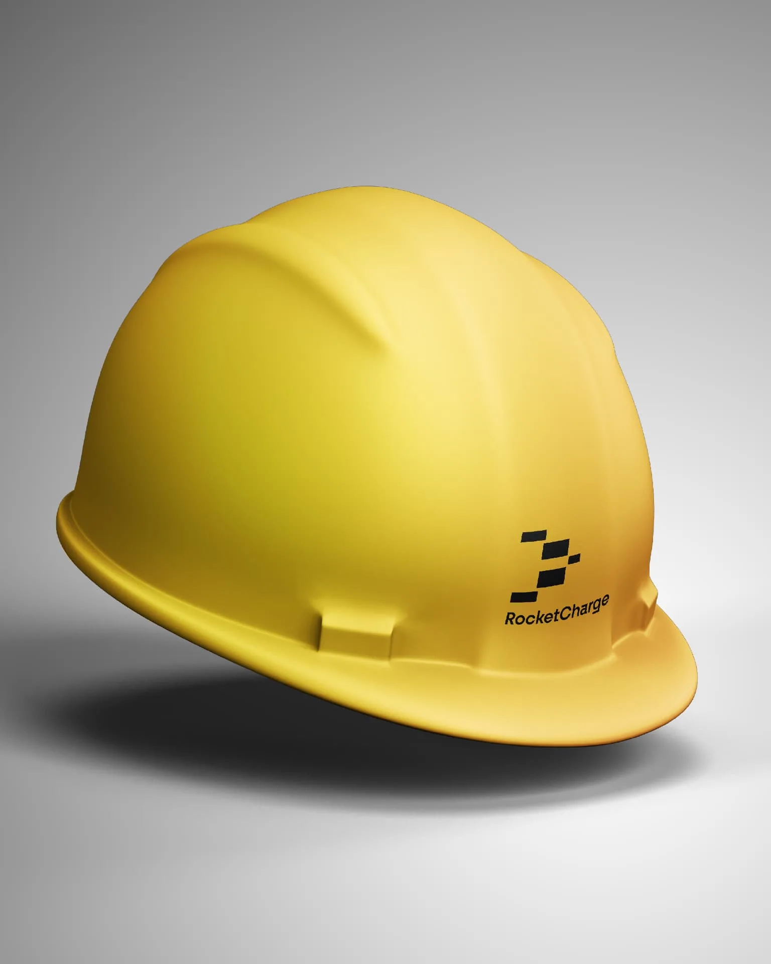
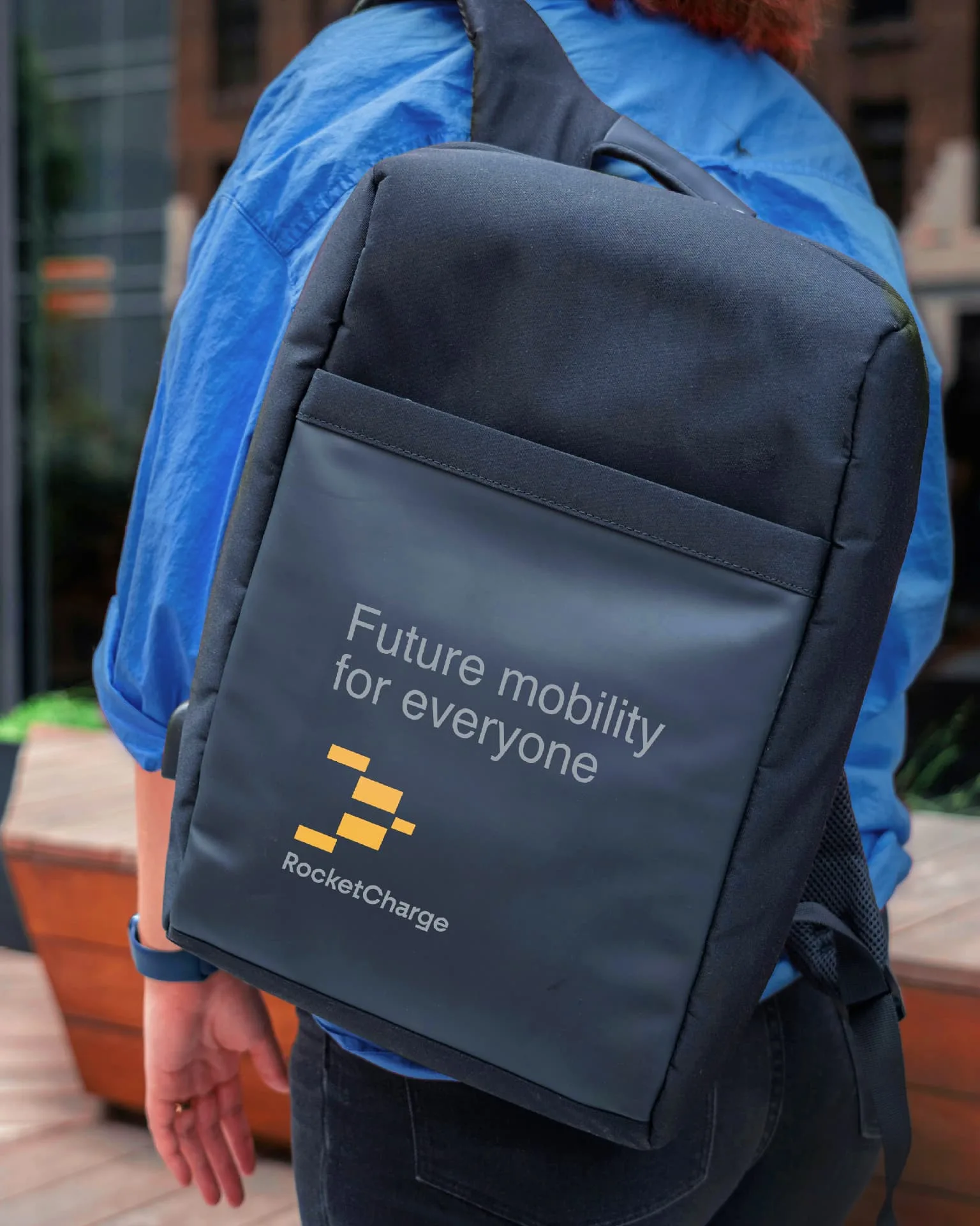
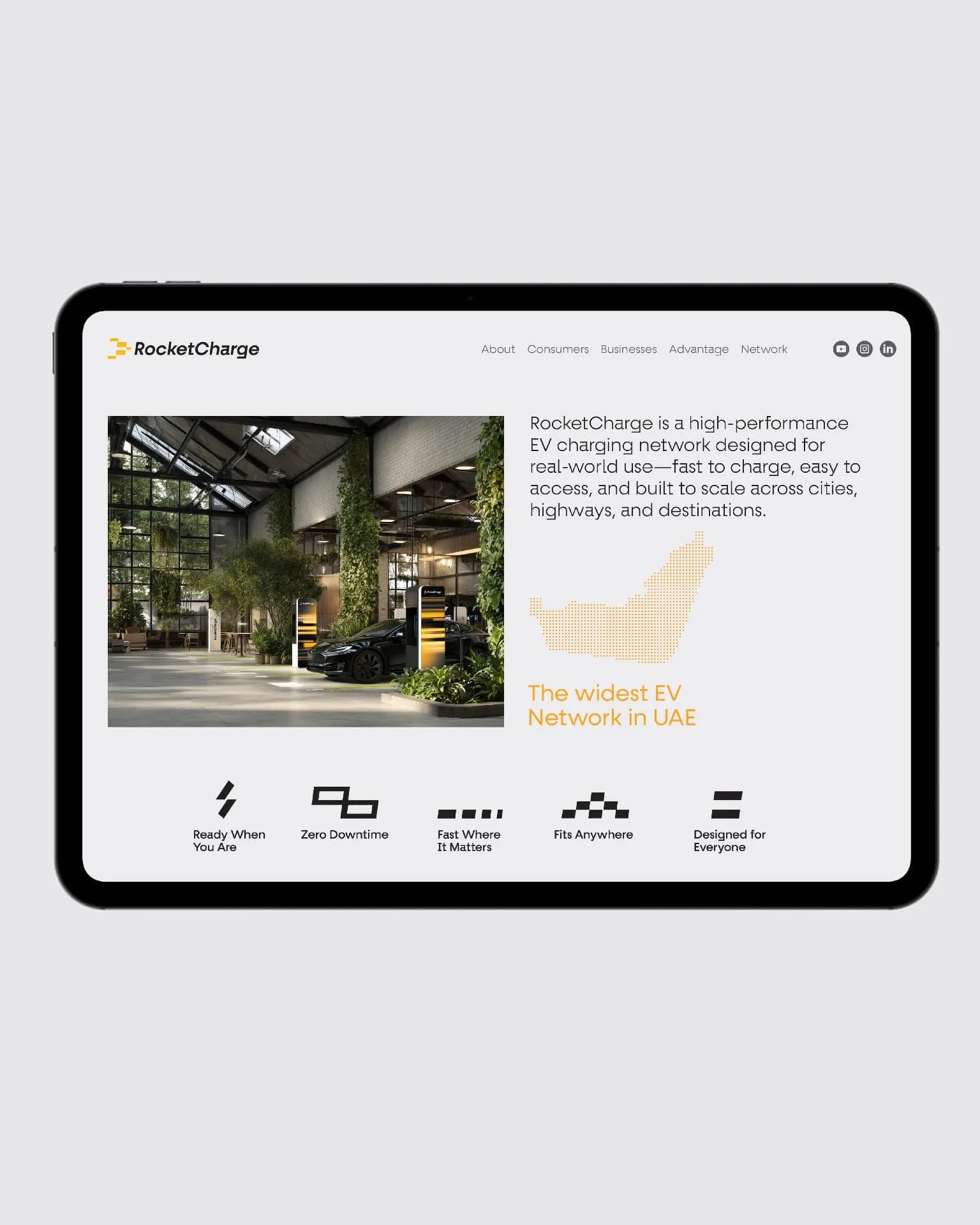
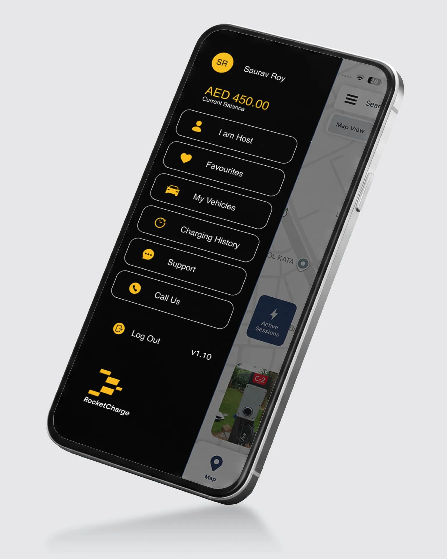
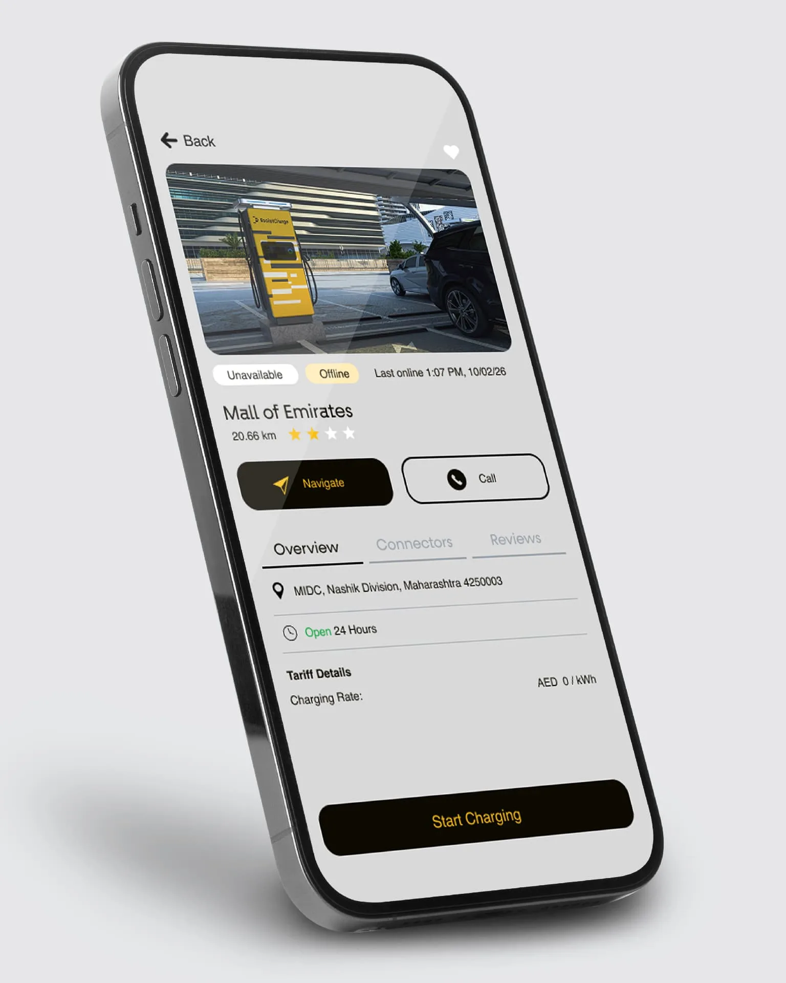
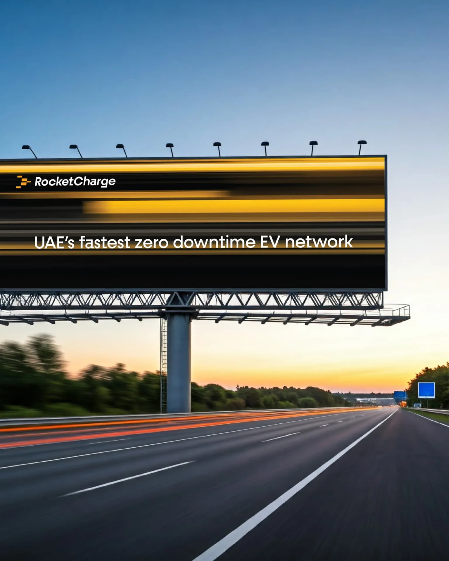
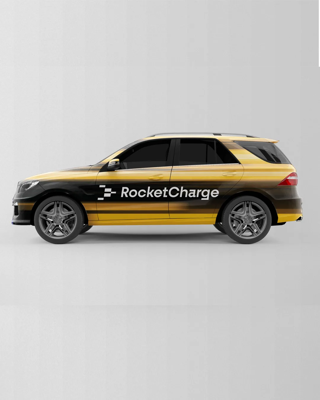
RocketCharge was designed as a complete experience, not simply a logo on a charging unit. The identity extends across the app interface, brand communications, wayfinding, fleet applications, signage, and graphic surfaces for the charging stations. The same visual language helps bring consistency to each of these formats, while allowing every touchpoint to do its own job clearly.
By building the system from one foundational element, we created a brand that feels connected wherever it appears—on screen, in space, and on the road.