SCOOP
BBC Newsnight Investigation Series
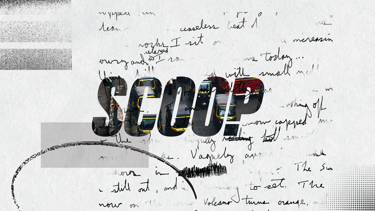
Scoop is a riveting Netflix investigative series based on real events. Its title sequence channels the urgency of journalism through tabloid-inspired typography, glitch textures, and a visual system that underscores hidden truths.
Scoop is a thrilling investigative journalism series takes you on a pulse-pounding journey, inspired by a true story that proves the adage: truth is often stranger than fiction.
Created and directed by Hansal Mehta and Mrunmayee Lagoo Waikul for Netflix. Through the title design & show packaging we worked to embody the essence of "Read between the lines" – unravelling hidden truths and uncovering untold stories.
We worked closely with the director - Hansal Mehta to develop the logo, title design and the packaging that was used within the film to create a consistent language for the show.
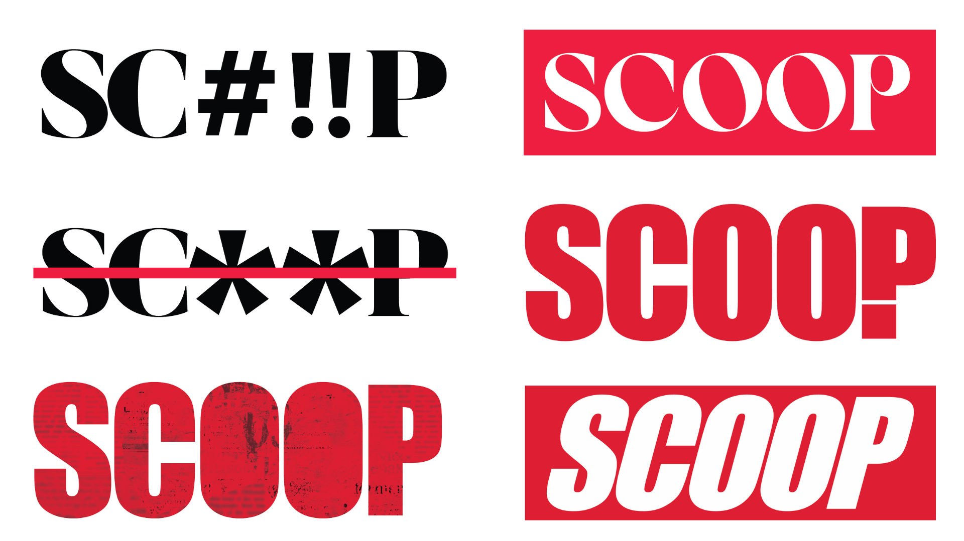
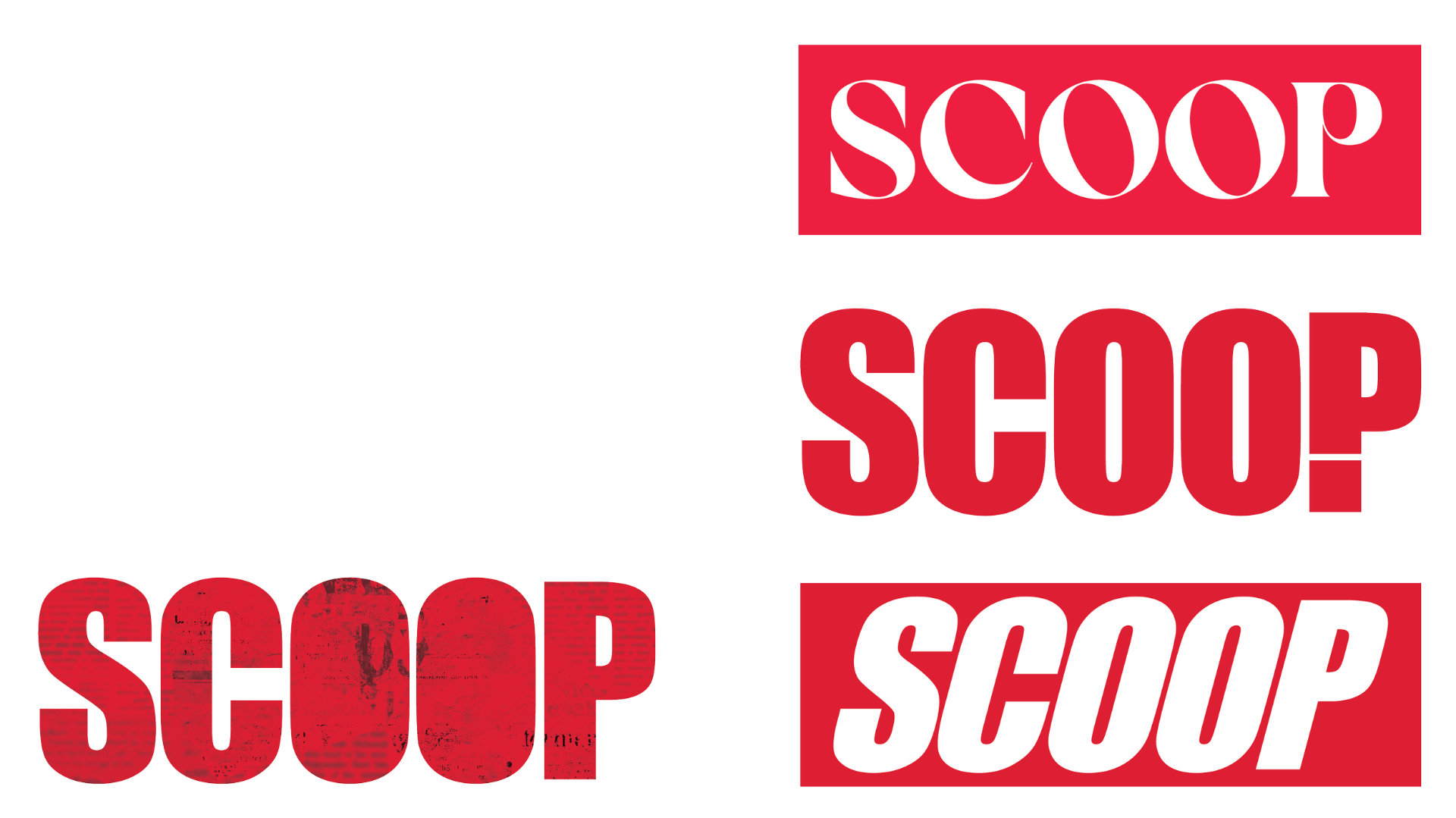
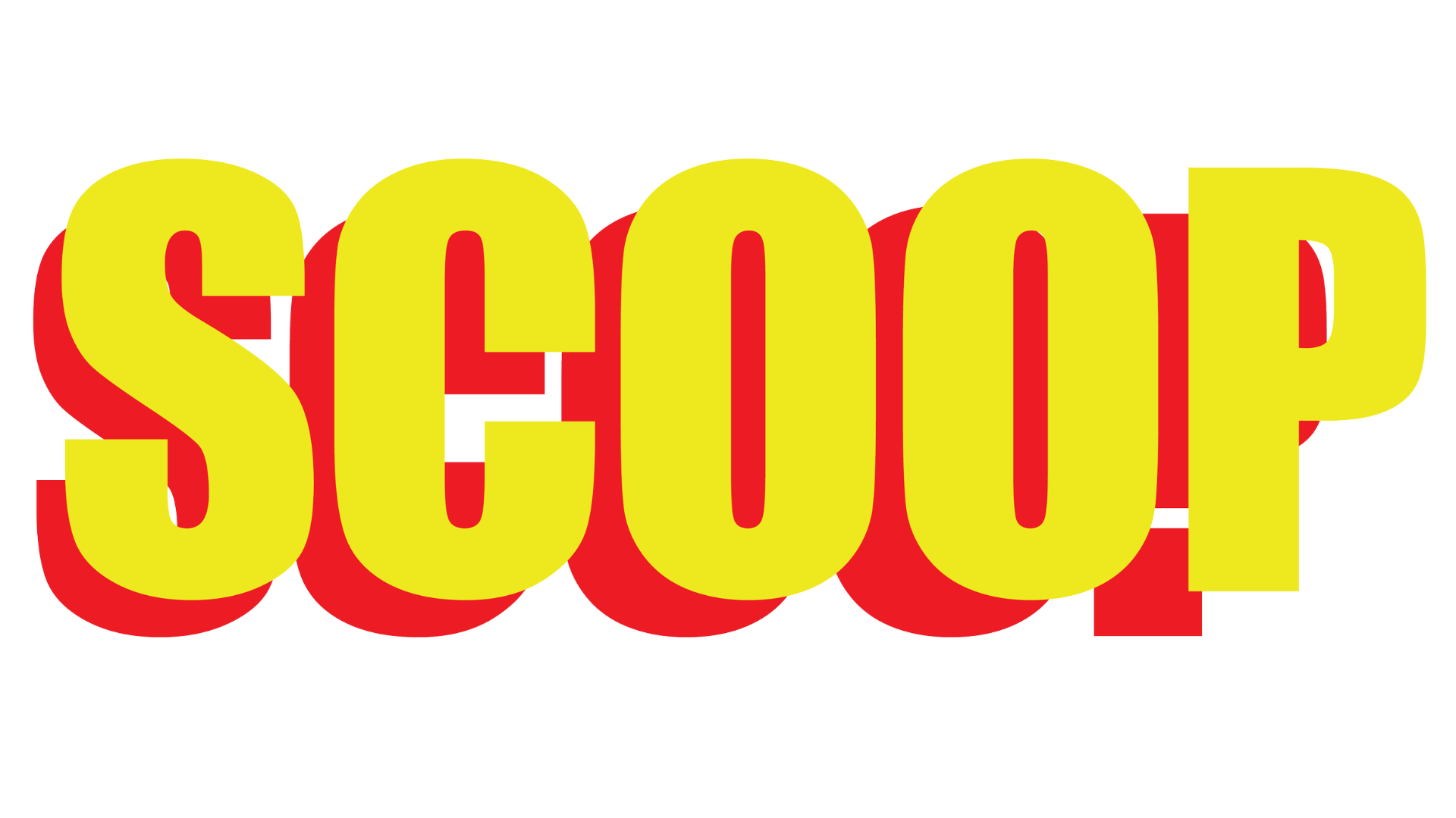
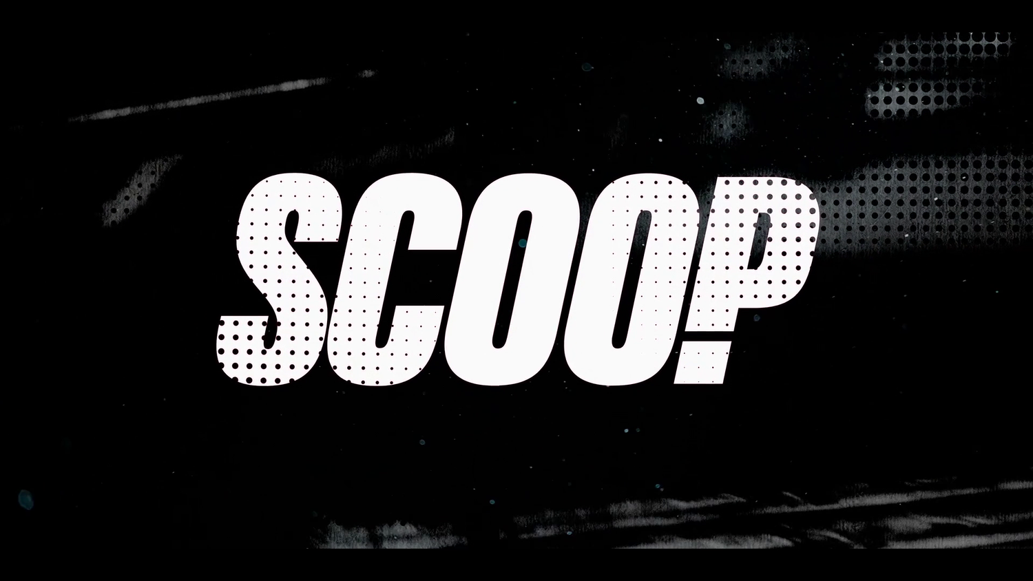
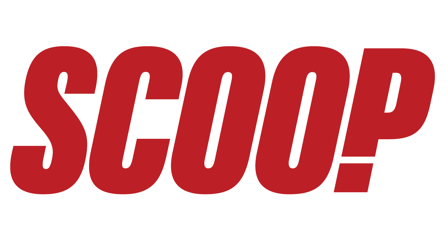
The show logo was crafted to reflect tabloid mastheads - referencing the plot line which features journalists from newspapers and loosely inspired from a true story set in early 2011. The early iterations of the show logo featured various versions and forms derived from tabloid mastheads.The final logotype featured a dynamic italicised typeface with the P modified with an exclamation mark. The logotype was designed to act as "window" to the show for the opening titles.
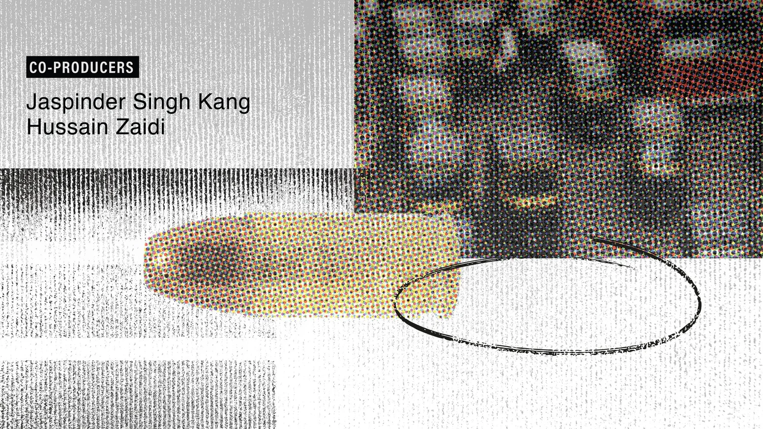
The end titles for the show uses the vocabulary from newspaper - half tone prints, text columns and shifted typography in motion to tie in the packaging for the show. We envisioned the end titles to create a dynamic motion based language that brings in the urgency and shifting power dynamics associated with a scoop.